


Art Supply Sub-Brand
Deliverables
1 Logo
3 Paper Pads
3 Art Containers
3 Posters
1 Catalog
1 Microsite
NOTA by Blick is a sub-brand of Blick Art Materials created to promote a small series of uniquely designed art supplies. Each product features a graphic in a different illustrative style to fuel and inspire the mind of the creatively inclined individual. NOTA by Blick encourages a hands-on approach to art and believes that by supplying the proper materials, there are no limitations to what the artist can envision. Dare to imagine with NOTA by Blick!
Proposal
NOTA by Blick is a promotional sub-brand of Blick Art Materials that aspires to fuel the creative spirit of artistic individuals. NOTA by Blick believes in the importance of staying in touch with the imaginative mind through the creation of art. This company aims to design an aesthetically pleasing sub-brand that kickstarts the mind of the artistic individual.
Since NOTA by Blick is a promotional sub-brand, it has a limited selection of products. NOTA produces three kinds of paper pads for three different kinds of mediums: pencil, watercolor, and pastel. Three art supply packages correspond to the paper pads: pencil, watercolor, and pastel containers. Posters designed by NOTA are distributed to high schools and colleges as a promotional element, featuring designs that incorporate elements of illustration and photography. A microsite will allow individuals to purchase the listed art supplies and posters online while learning a bit about the sub-brand and its mission. A small catalog will provide similar information to the microsite, featuring the listed products and giving a bit of information about the company. The catalog is intended for use by schools and universities that want to buy the product in bulk. The catalog will be 8 pages in length (including the front and back covers).
NOTA by Blick is marketed towards high school and college students with artistic and creative tendencies. While this is the targeted demographic (an age range between 14-24), artists of any age can use the products and enjoy the visual aesthetics.
Company Profile
NOTA by Blick is a promotional sub-brand of Blick Art Materials that aspires to fuel the creative spirit of artistic individuals. NOTA by Blick believes in the importance of staying in touch with the imaginative mind through the creation of art. This company aims to design an aesthetically pleasing sub-brand that kickstarts the mind of the artistic individual.
Since NOTA by Blick is a promotional sub-brand, it has a limited selection of products. NOTA produces three kinds of paper pads for three different kinds of mediums: pencil, watercolor, and pastel. Three art supply packages correspond to the paper pads: pencil, watercolor, and pastel containers. Posters designed by NOTA are distributed to high schools and colleges as a promotional element, featuring designs that incorporate elements of illustration and photography. A microsite will allow individuals to purchase the listed art supplies and posters online while learning a bit about the sub-brand and its mission. A small catalog will provide similar information to the microsite, featuring the listed products and giving a bit of information about the company. The catalog is intended for use by schools and universities that want to buy the product in bulk. The catalog will be 8 pages in length (including the front and back covers).
NOTA by Blick is marketed towards high school and college students with artistic and creative tendencies. While this is the targeted demographic (an age range between 14-24), artists of any age can use the products and enjoy the visual aesthetics.
Objectives
To independently research, design, and produce a logo, designed paper pads, art supply containers, posters, a catalogue, and a microsite for Nota by Blick.
To research a wide variety of illustration styles using the internet and various books dealing with illustration and graphic design.
To thoroughly utilize the foundational elements of graphic design in the development of thumbnails, roughs, comps, and finals for each component of the project.
To unify the components of the project through typography, branding, package design, and the creative design elements that capture the most visual attention.
To implement feedback from peers and professors when relevant and/or necessary.
To generate a successfully designed project with cohesive components and convincing designs.
Target Audience
NOTA by Blick is marketed towards high school and college students with artistic and creative tendencies. While this is the targeted demographic (an age range between 14-24), artists of any age can use the products and enjoy the visual aesthetics.
Process Work
Tools
Adobe Fresco
Adobe Illustrator
Adobe Photoshop
Adobe InDesign
Figma


Process Narrative
The process began with a ridiculous amount of thumbnails. These were mostly for the paper pad and art container graphics; less were for the posters. The main reason for the sheer number of thumbs was because of my indecisiveness; I had a very difficult time deciding what the subject of the graphics should be, given that there were no rules except that the styles should be different. Eventually, after much thought, I decided on the final concepts for the graphics.
Once I had decided on concepts, I worked with the ideas until I was satisfied with the composition. I created rough sketches in Adobe Fresco to get a general feel for the colors, textures, and other details that would make for a strong graphic. Once those steps were completed, I worked to finalize the designs. Some of the graphics would need to be very geometric, so I created a “skeleton” using the rough sketches as a reference, importing them into Adobe Illustrator. I then ported the skeletons over to Fresco again, creating the final illustrations using these guides.
A similar process was used in creating the posters, microsite, and catalog. Any geometric graphic had an underlying skeleton as a reference, elements which are apparent in the microsite and catalog.
Research Synopsis
Research was a key factor in the process of developing components for NOTA. It began at Hobby Lobby, measuring the dimensions for various paper pads and art supply containers. Once the measurements were taken, the process of sketching thumbnails could begin. For this step, I would research a wide variety of artists and styles to create a stylistically diverse set of illustrations for the product components of NOTA.
I leafed through The History of Graphic Design by Taschen and scrolled for hours on Pinterest to find stylistic inspiration. Instagram also came in hand, as I follow a multitude of professional artists on this platform. Finally, after countless hours of studying, I found some artists and styles that I wanted my illustrations to take after. I used Rat Fink’s art as key inspiration for the sketch pad illustration. Japanese pop art and video game design (utilizing the isometric grid) were inspiration for the watercolor pad graphic, and the principles of gestalt were used to inspire the pastel pad graphic. User eranalboher on Instagram and the Mutts comic inspired the exaggerated tiger: similar inspiration sources were used for the colored pencil and watercolor set graphics.
I looked at existing paper pads and art supply containers for organizational and informational reference. Using these existing products, I compiled together the necessary info and created layouts for the products, keeping in mind the graphic elements. Similar processes were conducted for the microsite and the catalog, to ensure that the company felt real.

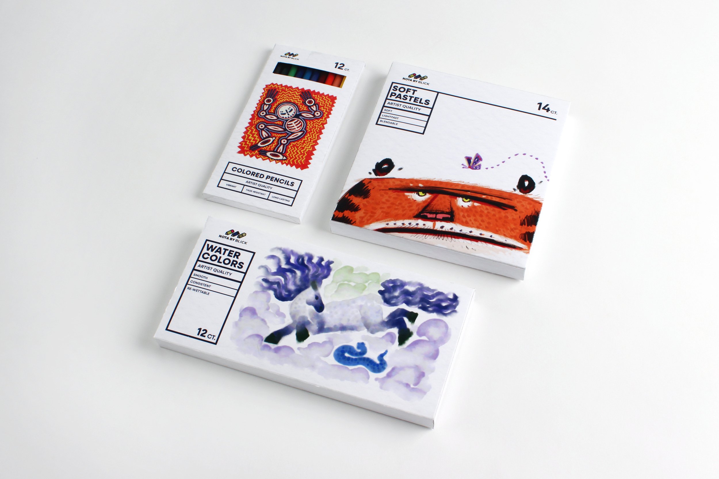
Paper Pads & Packaging
The paper pads and art supply packaging feature artwork done in a variety of different illustrative styles. The reason for this was to set the components apart from competitors, and to act as artistic inspiration for the target audience. These components feature bold and dynamic graphics, brought to life with saturated colors and attention to form. Each component was created with either colored pencils, watercolors, or pastels to suit the appropriate pad or packaging.


Posters
The posters were designed to showcase a variety of different visual aesthetics, similar to the paper pads and packaging components. However, these designs expand beyond illustration and take inspiration from stylistic choices used in graphic design. Like the components above, the posters are means of creative inspiration while promoting the brand to schools and universities.
Catalog
The NOTA catalog features all of the products shown above (sold in bulk) organized in an aesthetically pleasing manner using graphics from the Dare to Imagine poster. Here, branding elements begin to become apparent. Bright, saturated colors highlight geometric, dynamic shapes, giving the catalog a playful and imaginative feel. CTAs from the posters become recurring elements, unifying the branding components together.


Microsite
The microsite is similar to the catalog, featuring NOTA’s products for sale in a digital format. The branding elements are carried over, with geometric shapes forming dynamic graphics to create visual interest. Color is used to create a warm, welcoming user experience, working in harmony with the branding graphics.